Creating a safe space for seafarer's mental wellbeing
Product
HSE - Welness
Role
UX research, UX design, UI design
Date
September - December 2023
Platform
Android, iOS, mWeb
Project overview
Over the past month, seafarers have begun to suffer from mental health issues. Especially when COVID-19 occurs, while they still have to sail. There are many spectrums of causes. The starting point is to conduct user interviews to find out the root of the problem.
After defining the problem and creating affinity mapping from the interview results, we started brainstorming and creating design sketches, and designing a lofi esign to be tested on users.
The next thing is to conduct user testing with the previously created lofi design to find out user responses, and to iterate the design based on the user testing to make sure the user have appealing experience using the app.
In this step, we proceed to the hifi design process, and prepare all the documents needed to hand over to the developer for application development process.
Chapter 1
{ Think }
Learning about the contexts where seafarers are deciding on performances
'We do the interview with 10 seafarers to dig more the problem about mental health with the question such as what, how and why as primary research, and for secondary research we working on multiple process like desk-research, competitor analysis, and paper research about mental health to get right reference.'
In what context do seafarers prefer ignore the mental health issue over facing it? How do they work with it? Why do they search about mental health information? What problem do they have with this while on vessel? What things allow them to divert attention from mental health?
To find answers, we conducted 10 interviews with crews on leave (not on duty), observed people who were facing mental health issue, and learned a lot from in-depth desk-research like looking into competitors, other creative wellness app, research papers about mental health.

By synthesizing all the results using different models, we was able to discover our user's values and learn about their problems with facing the difficulty to seek information and distract the issue of mental health issue when they are onboard to sail.

Present journey as point of entrance
'After doing empathy mapping on user interview, now its time to seek on competitor lack of feature to cover user problem. Theres 3 competitor to research and found 3 problem on each of the app for MCA guidance, Crew Matter, and ISWAN for seafarers.'

In what context do seafarers prefer ignore the mental health issue over facing it? How do they work with it? Why do theDirect support and indirect support is more and more where the official support is way too far to reach. They choose to ignore the early affection of depression, because theres not much support and information they get about the mental health issue. They choose to deal with the situation to be able to adjust with the environment because they facing lack of direct and indirect support. In this case, direct support is support that they can ask directly, like their smartphone who give joy to ignore the issue, or taking notes about current job or taking nice pics as memory. Indirect support can be their friend or supervisor by discuss about the the working progress or another issue, or shore information about mental health.y search about mental health information? What problem do they have with this while on vessel? What things allow them to divert attention from mental health?
However, there is direct support in mobile form which limits health assistance. Working with mobile apps is an important part of sending submission or whistleblow form to shore teams, and aligning their team on goals feels impossible to do on another app like MCA Guidance, Crew Matter, and ISWAN for seafarers. A lack of self-expression Support is the main reason why seafarers use wellness app. Support can have various meanings, it can be direct support, indirect support or shore support, self-support, or even friend/colleague support. User can't get in a action to express the journey after reading the document about mental health. A lock of documentation The intention is there to distracting the user via bunch of video of exercising or doing workout, but the absence of documenting the process make user lose context of crew matter. A lack of repetitive activities Latest information on wellness can be attractiveness. Using it to read more about the crucial information is fine, but what next step? reading without taking action to implement the information is like learning football but not participating on the game.
Chapter 2
{ Make }
Cross-disciplinary ideation session
'Dump all the idea from the group using Miro and brainstorm about the idea for possible solution that feasible for the app from habit creation, capture moment, journaling, and wellness reference document.'
We ran an remote ideation session based on my research-results with the help of a design team to create first conceptual solutions. Being remote, it was harder to start with group-thinking, so we started out brainstorming different solutions on our own, combining the ideas of the group later on and building onto these ideas together using Miro.

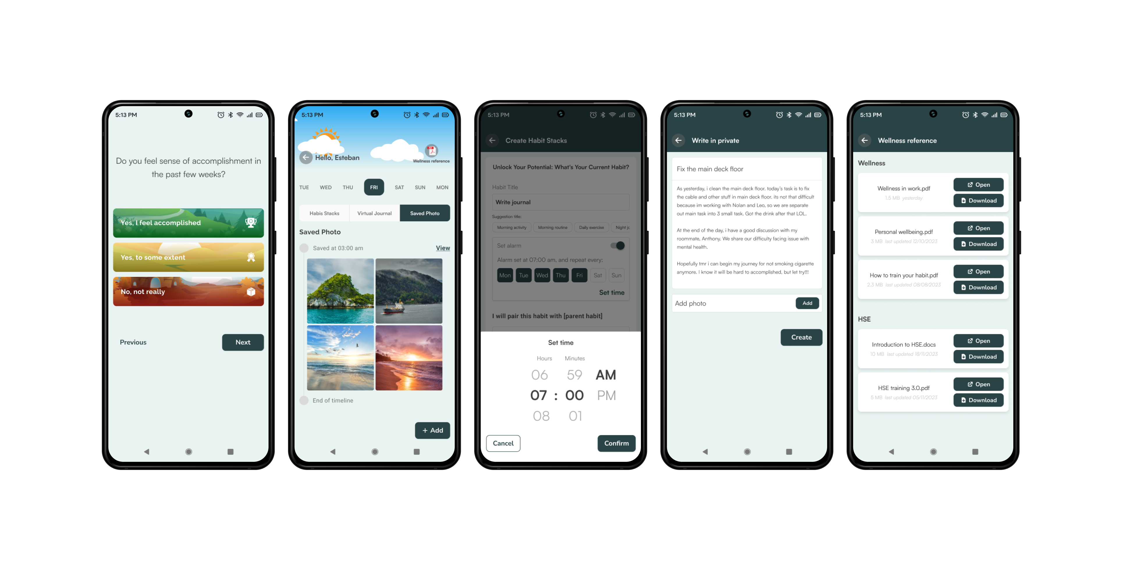
Solutions went from having habit creation and using a mobile device, to build a sort of layer-system from habit stack creation. Capture moment to take photo and seeing the timeline in a sort of preview window we all used back in the instagram days, and journaling as memory recognize in previous/current event.
Creating Design Guidelines to make decision-making easier
Once we had a solid direction for the design, my and my team began to produce multiple different variations of wireframes. We then put the designs in front of users and internal stakeholders for testing and feedback. This helped me to narrow the design down to two major variations, which we used to establish a single design framework, and thus move into visual design.
Prototyping mental models of possible solutions
'After finalize the possible solution from previous brainstorming, now we move to lofi wirframe. Creating multiple design from each flow on Figma, from onboarding flow, habit creation, journaling, capture moment until seek information document flow on wellness reference.'
Based on the results of the concepting session previously, we worked on several high-level prototypes using simple elements and wrote short write-ups of the solutions to think them through. By making the prototypes interactive, how simple they still were, we could deliver quick and simple usability testing to the user.
The directions included a basic version of onboarding selection, create new habit and set alarm, write journal and capture moment:

Chapter 3
{ Check }
Testing the explorations
'With prototype in hand, we tested the design to the user. the participant is the one who participate is the first user interview, plus new participant from user that never has interaction with us before. Theres 5 flow for participant to explore: 1. Explore onboarding until homepage, 2. Create new habit, 3. create journaling, 4. crate new moment, 5. seek information in wellness reference'
To learn to what extent these directions could solve the problem, we went over the prototypes with various users using Zoom/Google meet. Testing was conducted with crew and users that previously join the user interview plus some user that had never interacted with us before.

Iteratively prototyping and testing the core components to explore and understand solutions
'Based on user testing finding, we do the iteration to tackle user problem on previous user testing. Point of iteration is one onboarding screen, flow sliding behavior to one click behavior, date not showing number, but day (bold section is today), create larger box in fill section journal creation, give suggestion title for habit creation, etc.'
Based on the test results, we iterated on the multiple design concept. This brought up a set of interesting problems with the flow itself, from display on homepage to each stage of creation.
We iteratively the UI and tried to tackle all the problems, starting from the core of the application, working inside out. In various iterations, we translated point on onboarding (using slide to measure the point) to option on onboarding (using single click), figured out how straightforward-creation and multiple-directions within the app, and built up a suggestion to simplify the workflow, iteration after iteration.


Chapter 4
{ Result }
The result: a wellbeing app that helps seafarers to create habit, capture moment, and journaling.
'Based on extensive research on mental health to seafarers and user-test on interactive prototyping for wellness app, my prototype solve most of user problem, combining on theory using wellness reference to read and give user awareness about mental health issue and practice by creating habit stack to create more discipline work-life, journaling to write all the event that user experience on the past or current event, capture moment by taking photo and upload on the app.'
Based on extensive research and user-tests, my prototype solved the most problem stated at the beginning of the project. It can be the new tool to overcome their 'early-stage' of mental health issue, whether it's still a first move or a thought-through plan, the combination of theory (a set of wellness supporting document) and practice (habit creation, capture moment, daily journal) gave unique stimulus, whether they're envisioning what the right concept is or carefully shaping how they're going to creatively build the habit.
Because of the ease of use, the habit creation that show suggestion title for simply creation, and set tools for alarm to remind the event, seafarers can feel confident to create habit that fit their interest. And just as habit creation, journaling also help them to express their feeling of past or current event, or simply take photo of what they think its memorable, and maybe even the start of big change in their situation.


Land a smooth design handover
Working as team member means take care of personal task but also considering of streamline the project by give hint on the design process for the engineer team because it will help them on the deployment process after design handover. By initiatively creating design documentation, means give extra space for my team to working on the next process.

Wrapping up
To streamline the handover process to developer, we create design documentation. the purpose of this initiative is to set less-amount on design handoff process. This module was live on Dec '23, so until now we can’t do the analytic part to measure the successful rate because they some constraint followed, like seafarers training, and other technical. but i’ll do they ideal way by iterating the design regularly to make sure, this module will adapt user experience.
As this module live in the end of Dec '23, we not yet have the analytic on how the seafarers use it. Considering the start line of this is to help seafarers to overcome depression, mental health, anxiety. We commit to do the repeated iteration to make sure our app can fit the user idea.
Dividing the seafarers interaction into various stages for habit stack, journaling and capture moment and having wellness reference granted some clarity to a previously confusing process. However, the short development time and limited user testing means there may be some lingering user problems that still need to be flushed out.
- To understand the problem is most important part of solving it.
- To present multiple solutions, explain their benefits and disadvantage and explain which I felt best solved the problem.
Design process from start until design handover is a team work although has individual contribution in it. - Besides for the extensive contributions of my PM, it’s a collaborative effort with all stakeholders possible, from client through engineers.