Addressing Growth Challenges on Normies
Product
Normies
Role
UX research, UX design, UI design
Date
Aug - Oct 2024
Platform
Website, Mobile
Chapter 1
{ Discover }
Context
Normies is an innovative startup focused on facilitating seamless transfers between fiat currency and cryptocurrency. Within just one year of its launch, the platform experienced a significant surge in popularity, leading to increased traffic on its website. However, this influx of users brought to light several critical usability issues that needed to be addressed.
Problem statement
The rapid rise in website traffic highlighted several challenges that users faced. Many reported that the website was clunky, navigation was confusing, and performance was sluggish. Additionally, the platform's impressive achievements from the previous year were not adequately showcased, leading to a lack of trust and credibility among users. Our task was to transform the website into a seamless experience that accurately reflected Normies' growth and ambitions. This journey began with a thorough investigation into the root causes of these issues.

Setting the Stage
To understand the user experience better, we conducted stakeholder interviews and user surveys. The findings revealed a shared frustration among stakeholders: the existing site was failing to convert traffic into trust. Users expressed dissatisfaction with navigational dead ends and slow-loading pages, while competitors were enhancing their offerings. The mandate was clear: Normies needed a website that not only functioned better but also told its story effectively.
The Spark of Insight
Our research identified three primary pain points:
- Confusing Navigation: Users struggled to find what they needed, leading to frustration and abandonment.
- Poor Performance: Slow loading times resulted in high bounce rates, causing potential customers to leave the site.
- Lack of Credibility: The absence of a dedicated space to highlight achievements weakened user trust.
'But it wasn’t all bleak. These insights hinted at possibilities: Simplify navigation to make exploring effortless. Enhance performance to match user expectations. Create a dynamic achievements section to build trust.
However, these insights also illuminated opportunities for improvement:
- Simplify Navigation: Create a more intuitive user journey.
- Enhance Performance: Optimize the website to meet user expectations.
- Showcase Achievements: Develop a dynamic section to build trust and credibility.
Chapter 2
{ Define & ideate }
Gathering the troops
To address the identified issues, we organized collaborative workshops that brought together design, marketing, and development teams. During these sessions, ideas flowed freely, and we brainstormed potential solutions. Suggestions included creating an interactive timeline and streamlining the menu to reduce clutter. Our shared goal was to design a user journey that felt intuitive and inspiring.

Sketching the vision
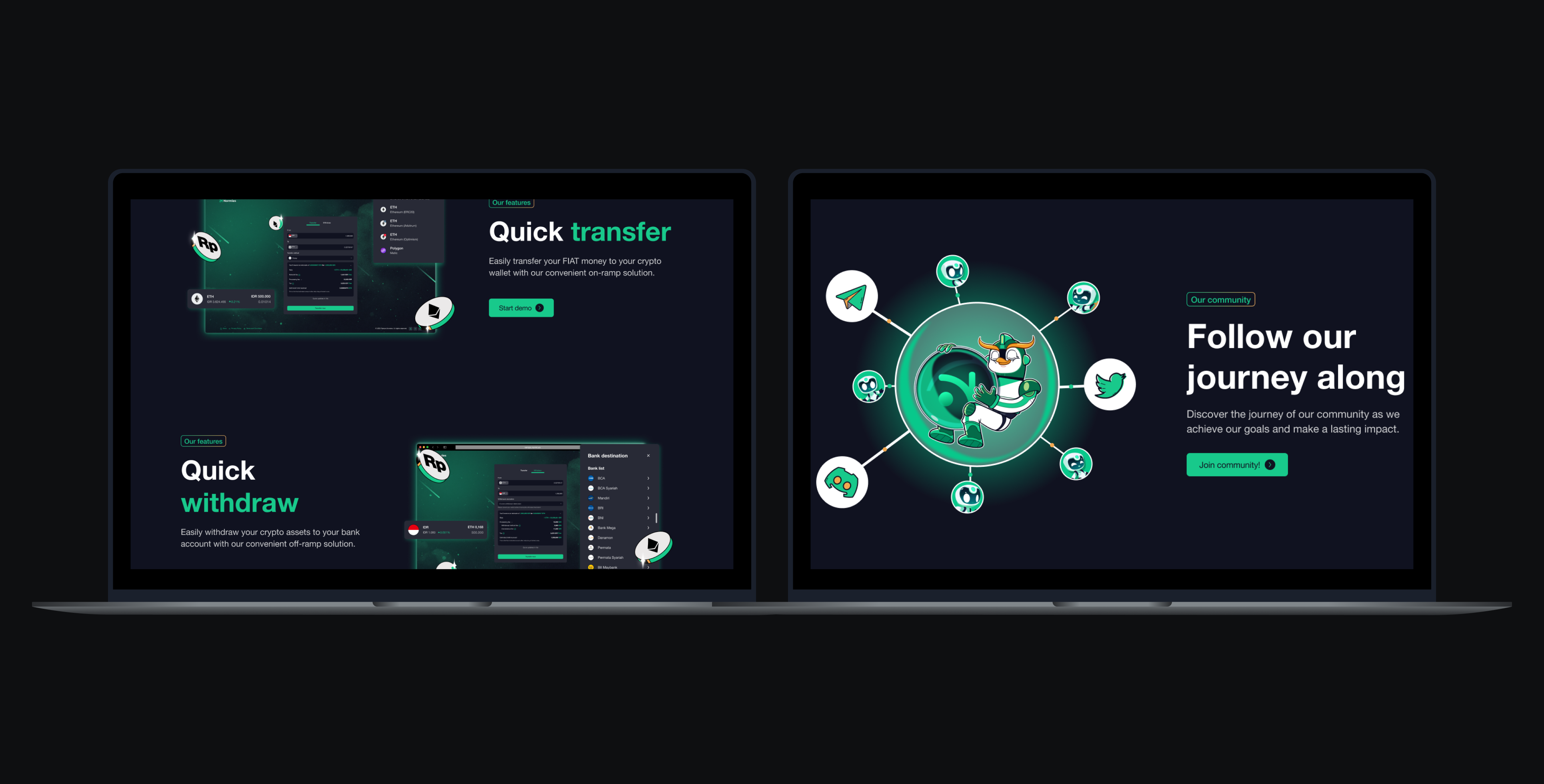
Together, we developed wireframes that prioritized simplicity and clarity. The envisioned homepage would greet users with Normies' achievements, including transaction milestones, user growth statistics, and testimonials. Call-to-action buttons were designed to stand out, guiding users seamlessly to their desired destinations. Navigation was streamlined, grouping related services intuitively to enhance user experience.

Chapter 3
{ Design & Develop }
The new look
The UI design adopted a modern and minimalist aesthetic, integrating Normies' branding throughout the site. The interactive achievements timeline became a focal point, inviting users to engage with Normies' success story in an enjoyable and interactive manner.

Enhanced experience
Every interaction was carefully considered. Navigation was simplified to ensure users could find what they needed without frustration. Micro-interactions, such as subtle animations when buttons were pressed or forms submitted, added a layer of delight to the user experience.
Accessibility for all
We prioritized responsive design to ensure a smooth experience across devices—whether users accessed the site on a phone, tablet, or desktop. Rigorous testing across various devices guaranteed consistency and usability.
Working hand in hand
Collaboration with developers was essential throughout the process. Weekly check-ins ensured that the design vision was accurately translated into code. We tackled challenges together, such as optimizing animations for performance without sacrificing user experience.
A fater, smarter website
Performance optimization became a key focus. We implemented strategies such as image compression, script trimming, and lazy loading to enhance loading speeds. The result was a website with lightning-fast loading times, significantly improving user satisfaction.

Chapter 4
{ Validate & launch }
Listening to the user
Usability testing provided valuable insights from fresh perspectives. Feedback highlighted minor frustrations, such as button placements, which we promptly adjusted. A/B testing confirmed the effectiveness of key elements, including navigation layouts and call-to-action designs.

Stepping into the Spotlight:
A soft launch allowed us to gather real-world feedback without the pressure of a full rollout. This phase provided an opportunity to fine-tune the website and address any overlooked issues.
The Big Reveal
After a final round of polish, the revamped Normies website was ready for public launch. The launch was celebrated with email campaigns and social media buzz, inviting users to explore the exciting changes.
Tracking success
Post-launch analytics revealed a compelling success story:
- Page Load Times: Improved by 40%, leading to a more satisfying user experience.
- Bounce Rates: Reduced by 25%, indicating increased user engagement.
- Engagement with Achievements Section: Soared by 60%, demonstrating the effectiveness of our storytelling approach.
- User Feedback: Praised the clean design and smoother experience, validating our design choices.
Wrapping up
The Normies website revamp was more than just a design project; it was a collaborative journey to redefine how users interacted with the brand online. By focusing on user needs, leveraging team collaboration, and committing to iterative improvement, we transformed a struggling platform into a thriving digital experience. This case study highlights the importance of user-centered design and the impact of thorough research and collaboration in creating a successful online presence.
- Purpose-Driven Design: Simplified navigation, enhanced performance, and storytelling brought the brand’s achievements to the forefront.
- Collaboration at Its Core: Cross-functional teamwork ensured every aspect of the website met both user expectations and business goals.
The journey wasn’t without its hurdles. Aligning stakeholder expectations with user needs required careful negotiation. But the iterative process of testing and refining proved invaluable, underscoring the importance of listening to users.